5 Examples of Scary Website Design and How to Avoid Them
By Jordan Eller

Don’t spook your audience with bad website design!
As a life science company, your website is your lifeline. It’s your best tool for engaging your target audience and delivering content that will compel them to start a conversation with you. Tragically, many life science companies are scaring away potential customers by failing to implement appropriate design choices into their sites.
Below is a short list of design mistakes that are proven to spook your audience and reduce engagement. Take a hard look at your site and make sure you’re creating a pleasant, accessible experience for your users!
If you’re looking to increase engagement and convert more users, reach out to Forma today and ask how we can help expand your digital footprint with our Digital Marketing services.
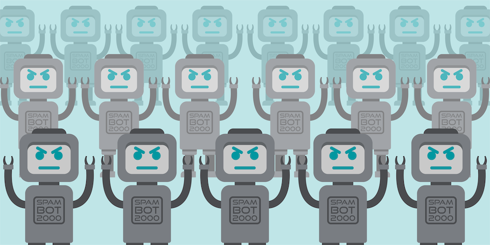
1) Poor image use
According to TributeMedia, you have about 7 seconds to grab your user’s attention before they leave your site, and images play a huge part in this process. Using uninteresting or low-quality images is a surefire way to lose your audience’s attention. This can include cheesy stock photos or images that are packed with text, which can be exhausting on the eyes.
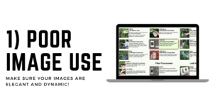
Instead, use a more elegant approach. Try simple images and shapes that draw the eye and entice users to continue exploring the site. Experiment with symbols and vector images that grab attention and don’t overwhelm the user.
Images are a crucial element of good website design, but if they’re not properly designed, they can do more harm than good.
2) Non-responsive site pages
Statistica reports that over 50% of web traffic comes from mobile devices. That’s a far cry from the 30% of mobile users in 2015. The truth is that more and more users prefer mobile browsing over conventional desktop browsing, and your website should account for that.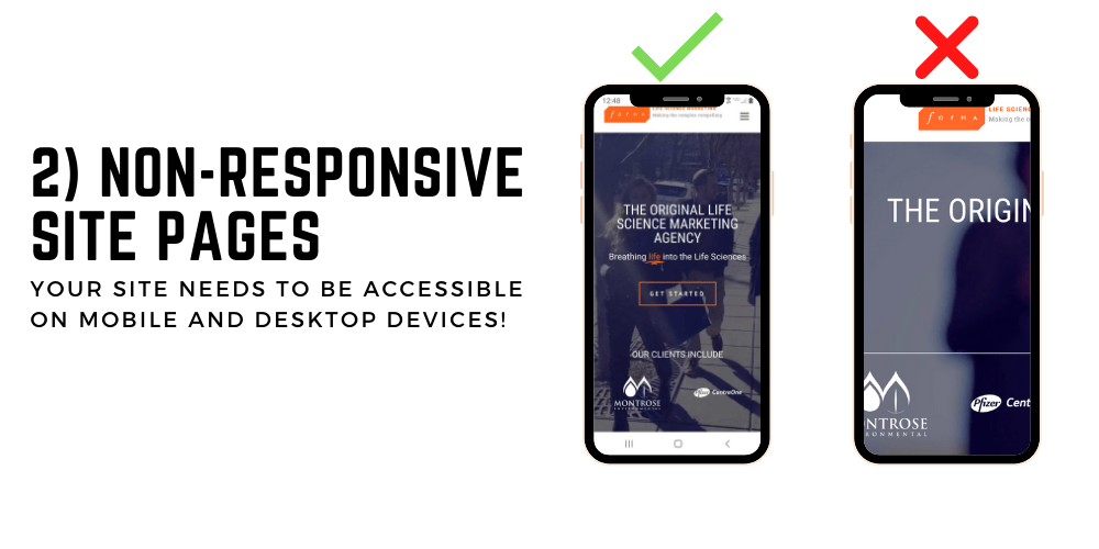
Taking the time to make sure your mobile users have a pleasant experience on your site is well worth the effort. Many modern Content Management Systems (like WordPress) account for mobile responsiveness, so it should be relatively easy to guarantee a stable and responsive mobile site.
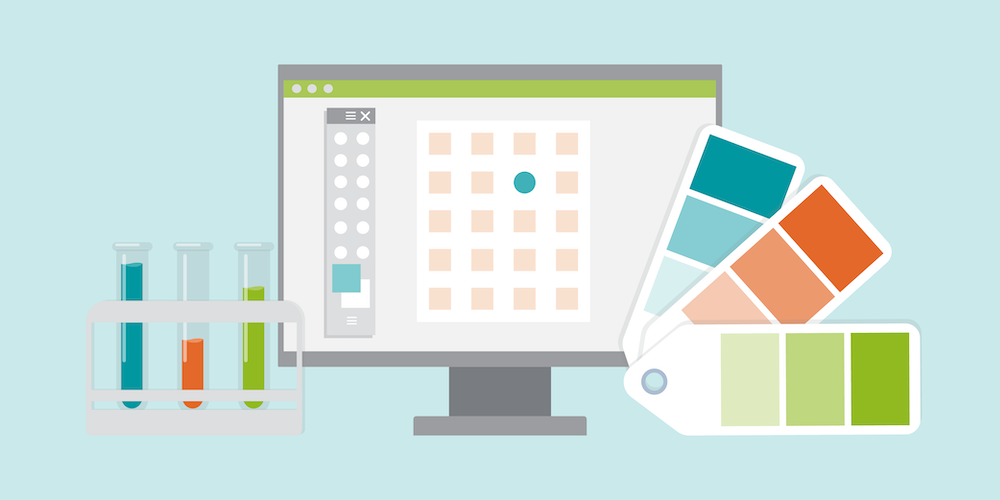
3) Sloppy typography
Websites are comprised of content, and the most impactful form of content is text. Text can tell stories, guide behavior, and educate users in ways that no other form of content can. This is why it is absolutely paramount to nail your site typography.
Start by selecting 2-3 fonts for your website. Once you’ve selected your fonts, assign each font to a header structure. At Forma, we use the Roboto Slab font for our page headers, and Roboto for our body text. This combination results in a sense of consistency while also remaining distinct and dynamic. Try to choose typefaces that are complimentary in order to draw the user’s eye and make it easy for them to scan your website.
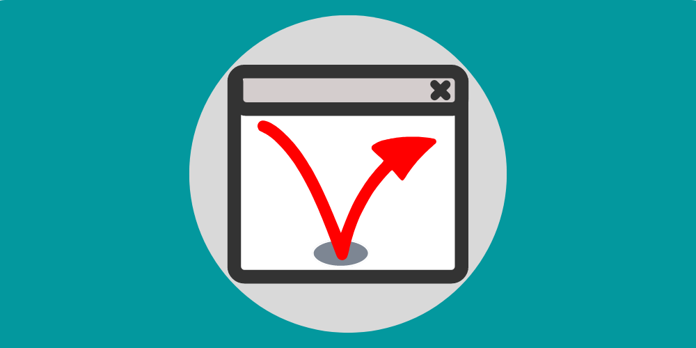
4) Dead links
This one is pretty self-explanatory. In short, you want to make sure all your links on your site are live and that they point users to the correct destination. Dead links are not only a source of frustration for users, but they will also result in lower ranking on search engine results pages.
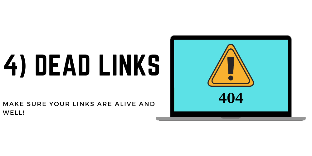
Strong linking structure throughout your site will benefit both users and search engines. When optimizing your site, pay extra attention to how you use links. Moreover, if your site hasn’t been refreshed recently, make sure your existing links aren’t directing users to unpublished pages or broken destinations.
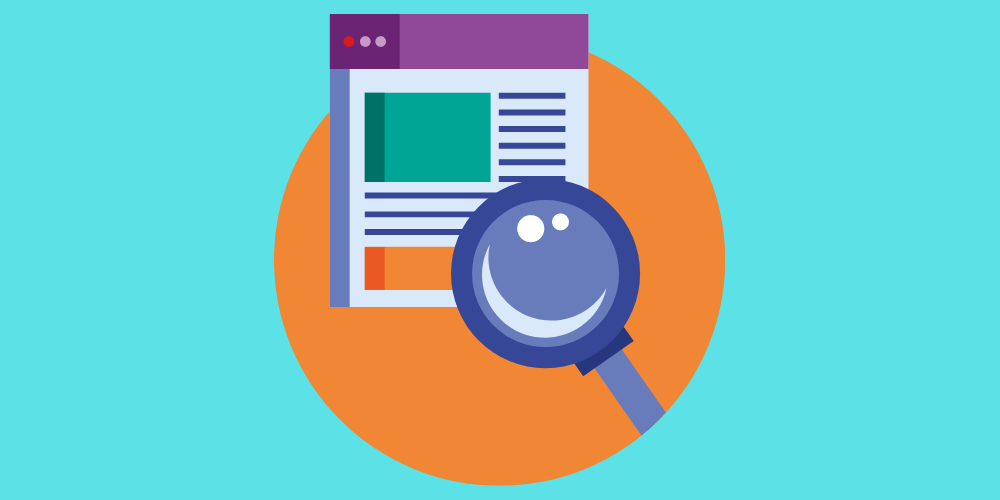
5) Unorganized site navigation
We see this a lot in life science website design. All too often, life science brands will pack their main navigation menu full of dozens of separate links and technologies. It makes sense, right? If a clinical research organization has a wide array of services and industry expertise, why wouldn’t they cram as many links as possible into their main navigation window?
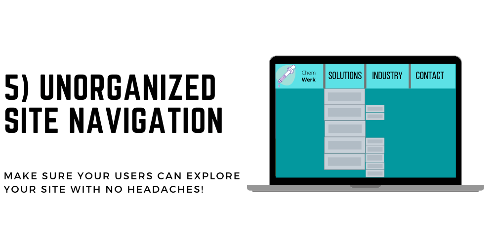
The truth is that if your users can’t easily find what they’re looking for, they’ll leave your site. Your website navigation structure should permit users to arrive on any page on your site and find what they want within 3 clicks. This means your site navigation should be straightforward and accessible. It doesn’t mean you should delete pages or content that might be useful; instead, make those pages easy to access and relevant to the user’s taste. If they’re browsing a whitepaper, there should be a link to a relevant service within that whitepaper.
The goal here is to make it as easy as possible for your audience to find what they need. By simplifying ths process, you make it easier for your users to find relevant content and engage with your brand in record time.
If you’re interested in how Forma can help your life science brand create a cutting-edge website guaranteed to convert users and increase revenue, contact us today!